We have moved to a new Sailfish OS Forum. Please start new discussions there.
9

Poll: What would be the best way to re-activate the hidden applications? [not relevant]

asked 2014-01-13 15:25:22 +0300

this post is marked as community wiki

This post is a wiki. Anyone with karma >75 is welcome to improve it.

updated 2015-03-06 09:48:39 +0300

eric gravatar image

In the Home screen max 9 application can be open at the same time. After that launching new applications will move the oldest running app to hidden "state".

What would be the best way to re-activate the hidden applications?

edit retag flag offensive reopen delete

The question has been closed for the following reason "question is not relevant or outdated" by Kari
close date 2015-08-10 15:17:01.641064

Comments

@eric - Was it so that also the answers are supposed to be created as Wiki in polls?

Kari ( 2014-01-22 11:21:27 +0300 )edit

@Kari: yes, please see: https://together.jolla.com/question/16697/ thanks!

eric ( 2014-01-22 11:25:18 +0300 )edit

Ok - my mistake it was in too obvious place :)

I'll keep tracking possible new answers more carefully now...

Kari ( 2014-01-22 11:35:44 +0300 )edit

Is a sailor allowed to give us a status about the poll subject ?

TNZ ( 2014-03-11 14:21:15 +0300 )edit

11 Answers

Sort by » oldest newest most voted
32

answered 2014-01-22 02:39:33 +0300

this post is marked as community wiki

This post is a wiki. Anyone with karma >75 is welcome to improve it.

updated 2014-01-22 11:11:58 +0300

Kabouik gravatar image

This is a hot topic I have been discussing a lot on IRC and TMO. Some ideas I proposed were admittedly difficult to realize, I think. So here if I have to chose only one idea, let's try this one: why not thinking of Sailfish "views" (lockscreen, homescreen, launcher) as layers (I keep fuillscreen application apart on purpose)?

This would involve very limited changes to the current system actually, as it would only add edge swipes to the homescreen, and replace vertical scrolling within the launcher with horizontal scrolling using edge swipes. In terms of usability, I think it would be quite easy to learn. Perhaps even more than current version of Sailfish, as each view (or layer in the picture) and its associated functions would be kept in only one row. Currently, this is not the case because the launcher spans over several vertical pages, as do ambiances.

I summarized the idea with the mockup below, please feel free to tell me what you think, including "It's bullshit dude." Note that I featured an additional quickbar on page 2 of homescreen which actually corresponds to the icons below the primary quickbar, but I ended up thinking it is silly and would overcomplicate the launcher. Keeping the same quickbar over all homescreen pages would be way better. Please also note that displaying the "current page dots" on top left (same as dots currently included in native Sailfish apps actually, it's just a dirty version here) would require moving covers a bit downwards (which I did in the mockup) and slightly reducing space between application icons in the launcher (which I did not do).

Sailfish concept

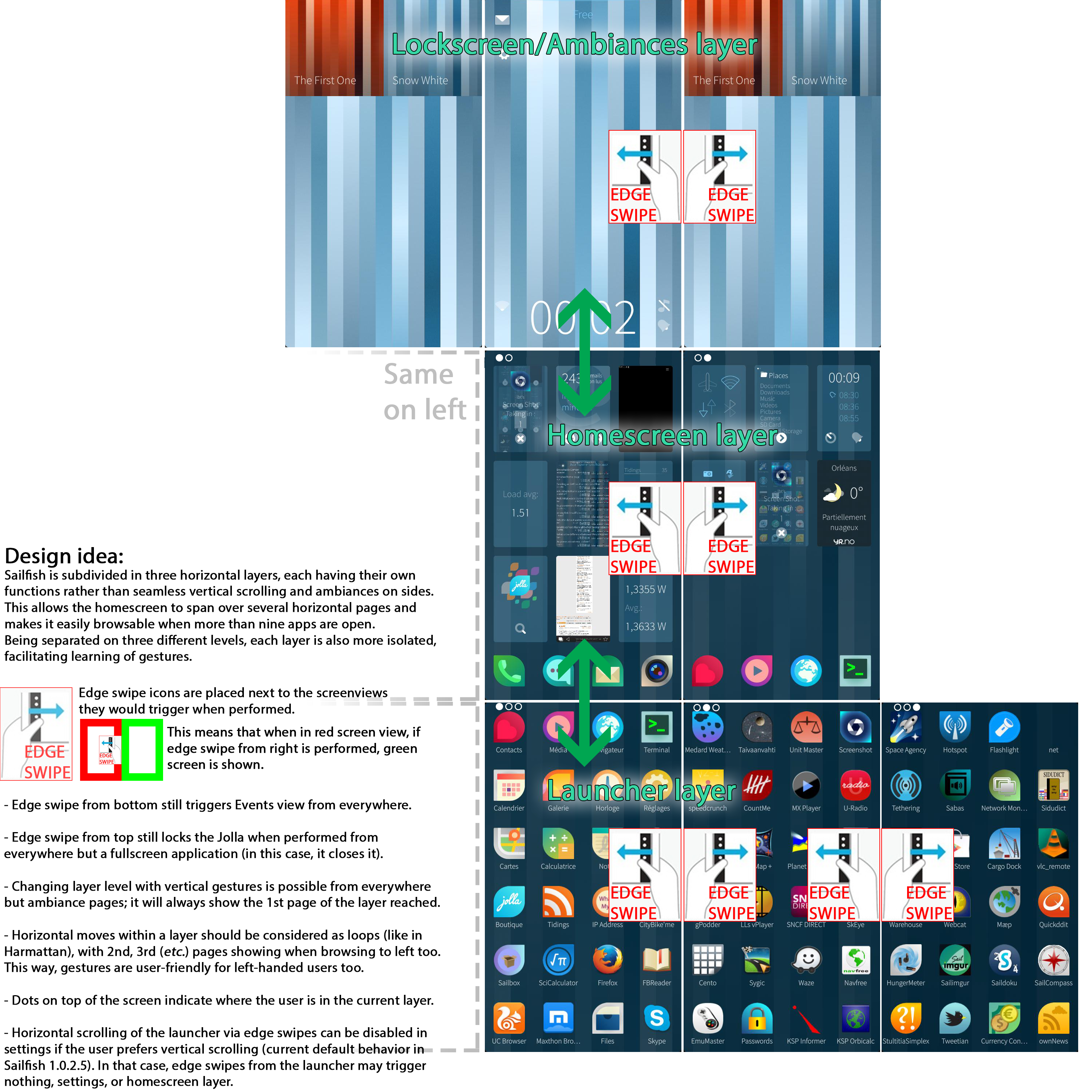
Higher resolution here.

If dumb or not achievable, then I must say that my preference would be for simply vertically scrollable homescreen, just as the launcher currently is. For sure, it would require more moves to go from homescreen to launcher and vice versa when more than 9 covers are open, and the quickbar design may become an issue, but I still prefer that simplistic (and admittedly logical, considering current Sailfish design) idea over not showing all runnings apps. People would hardly have more than two page of nine covers (18 covers total) anyway, so it would only add one move to current Sailfish design.

If people are not enthusiastic with the idea I detailed above, I must say I really like the idea by @ssahla too (inspired by @TNZ's idea), apart from the "automatically collapse" part (this should be user configurable in settings or in the pulley menu of the homescreen).

Kabouik

P.S. Some may argue that using edge swipes to scroll within the launcher instead of regular gestures is weird. I kind of agree because, currently, we use vertical gestures inside the screen to do that, not edge gestures.

However, (i) regular horizontal gestures are not possible on the homescreen due to cover actions, and (ii) switching between lockscreen and favorite ambiances already requires edge swipes, not regular gestures from inside the screen. Therefore, using only horizontal edge swipes to turn pages within layers seems more consistent to me. Inside horizontal moves would be specific to applications, I guess. Inside vertical moves would still change layers, and edge vertical swipes would keep their current functions.

P.P.S. Currently, when more than nine covers are open, they can be scrolled after a long press is performed on the homescreen (to show closing X icons). I really hope this feature of the long press will be kept, regardless of the solution which will be chosen to show more than nine covers. Even better would be to add reordering capability while in this state, and a "Disable auto ordering" option in pulley menu. Actually, I think it would quite well live with the idea in the above picture.

edit flag offensive delete publish link more

Comments

@eric Why setting all answers as wiki? It would be easier if only the initial question was a wiki, so that everyone can contribute to making the ideal answer in the same post by picking good ideas in all answers below (votes will help sorting them, but good ideas can be in answers with few votes too of course), rather than splitting contributions into different posts. Tracking changes in multiple posts is going to be very difficult, and the relevance of votes before changes is questionnable. Regular answers with a single wiki post on top, where everyone contributes, comments, and argues the changes, seems better to me.

Kabouik ( 2014-01-22 10:43:28 +0300 )edit

@Kabouik: this is the agreed rule when organizing a poll. Please refer to: https://together.jolla.com/question/16697/ Thanks! Note you can get more information on general usage by reading topics with guidelines tag under the featured tags section on the front page.

eric ( 2014-01-22 10:48:42 +0300 )edit
1

@eric Thanks for the link, I admit I missed that. Still, I feel it may complicate the process supposed to lead to a unique "ideal" answer. People will just split their comments and contributions into their prefered answer, ending up in several concurrent answers rather than a winner. Of course the concurrent answers can still be sorted by votes, but all votes made before significant changes are not relevant anymore, which makes the sorting questionnable. Anyway, not arguing, I missed the rule. My bad sorry. I feel a bit frustrated I have not even enough karma to edit other posts.

Kabouik ( 2014-01-22 10:54:57 +0300 )edit

I love this one. It's also the most intuitive solution, even more than the current one. It is also infinitely expandable.

Giacomo Di Giacomo ( 2014-01-22 11:11:29 +0300 )edit
1

I like this one, because it uses swipes, but is not too different from well known concepts like the Android home screens. The first thing, Android users do when trying my Jolla is swiping left/right on home screen to see the rest of the "widgets". Ambiance changer in lock screen is enough.

yoktobit ( 2014-01-22 12:54:59 +0300 )edit
11

answered 2014-01-22 00:01:51 +0300

this post is marked as community wiki

This post is a wiki. Anyone with karma >75 is welcome to improve it.

updated 2014-03-11 14:33:10 +0300

TNZ gravatar image

I've got an idea to manage home-screen with more than 9 apps running.


Until 9 apps, home screen works as today.

At 10 apps, the 9th app emplacement becomes a "scroll app" (a fake app in fact) with a cover-action allowing an horizontal scrolling from left to right. Using the cover-action, the screen scrolls and shows 9th and 10th app running with the "scroll app" on the 9th position but in this case the cover action is "Previous screen".

You see the concept ?


And now, let's imagine what could be the cover-action of "scroll app" ... to have a clear view let's do it with a huge number of apps running (the N900 freezed around 32 apps running) :

  • Screen 1 : 8 apps & "scroll app" with "Last screen" / "Next screen"
  • Screen 2 : 8 apps & "scroll app" with "Previous screen" / "Next screen"
  • Screen 3 : 8 apps & "scroll app" with "Previous screen" / "Next screen"
  • .../...
  • Screen n : x app & "scroll app" with "Previous screen" / "First screen"

Cover-action "Last screen" & "First screen" enable a circular scrolling.


If you feel enthousiast, please vote. Maybe it could give ideas to UI designers.

TNZ

An important thing to keep in mind : Landscape display for home-screen seems to be in the pipe. As I said in a comment, cover-action MUST be usable all the time. I guess, on dev side, that cover-action size is fixe, so cover-action progamming could become more complicated. That's why ideas should be simple to have a chance to be implemented.

Gesture point of view :

with 1 or 2 cover-action gesture like, the user gets the cover of selected app directly usable (cover-action or maximize).

@ssahla suggestion is good in terms of overview of running apps and cover-screen number.

@Aigner comment points a detail I didn't think about : more than 9 apps running appears clearly.

This gesture can be done in one hand / one finger configuration. It's quick & effective.

11th march update : after watching videos of MWC, especially the one presenting Rovio OH, this idea is still compatible with lateral extension of home-screen. Is a sailor allowed to give us a status about poll subject ?

edit flag offensive delete publish link more

Comments

3

Not a bad idea!

Alternatively, instead of a "scroll app" you could have just navigation icons taking the place of the ninth cover. Then it wouldn't be confused with the real app covers. (Basically the same thing, but a little different appearance.) You could also fit in an indicator showing how many apps are running right now / how many pages of running apps you have.

The downside would be having only 8 covers visible when you have more than 9 running.

ssahla ( 2014-01-22 00:30:53 +0300 )edit

Effectively, you're right about the design. The main idea is to use the 9th place and propose dedicated cover-action. Buttons could not be large enough. [big finger inside] :)

TNZ ( 2014-01-22 00:37:11 +0300 )edit
1

I like that Idea. It clearly indicates that there are more than 9 apps running and gives the user a way to reach these apps in a obvious way!

Aigner ( 2014-01-22 17:26:30 +0300 )edit
3

answered 2014-01-21 22:02:46 +0300

this post is marked as community wiki

This post is a wiki. Anyone with karma >75 is welcome to improve it.

updated 2014-01-22 10:18:57 +0300

eric gravatar image

Introducing an indicator for running applications at the launcher pages and thus make the finding and selection of the running applications easier?

edit flag offensive delete publish link more

Comments

1

If they add folders/categories into the launcher, this could be a bit annoying. I rather have some sort of scrolling through all running applications 9 at a time.

PyroDevil ( 2014-01-21 22:55:19 +0300 )edit
3

answered 2014-01-22 01:05:23 +0300

this post is marked as community wiki

This post is a wiki. Anyone with karma >75 is welcome to improve it.

updated 2014-01-22 10:20:04 +0300

eric gravatar image

Another idea: Expand & collapse cover view.

When you have more than 9 apps running, the ninth cover will be replaced with an "expand" icon (some kind of arrow down maybe) with a number showing how many more apps you have running. When you tap it, all running apps will be shown (just like when you tap-and hold to close apps), and you will be able to scroll down through them.

Once you reach the bottom, in place of the last cover there's a "collapse" icon (arrow up), and the normal four app icons are below it (and launcher screens further below). Tapping "collapse" returns you to the normal view of max 9 covers. The view will also be automatically collapsed once you enter an app.

Inspired by @TNZ's idea.

edit flag offensive delete publish link more

Comments

I like this idea. Mine may turn out being judged too different from current Sailfish design, so I have to say it. :] My vision of it is that taping the 9th "special" cover should put the homescreen in a state in which vertical scrolling is possible (either smooth or discretized scrolling). The longpressed homescreen should allow manual reordering, and its pulley menu options should include Disable/enable auto-ordering by recency, and Disable/enable autocollapse. The first option, together with the reordering feature of the longpressed homescreen, would allow using covers as widget-like covers (they would stay in the order you manually set them). The latter would be useful to users who often have more than 9 apps open, having permanently a bigger (taller) homescreen. Sure, a bigger homescreen would make the launcher more difficult to reach, but it would actually most often add only one move, and users who have a lot of covers available don't need to launch new applications from the launcher very often.

Kabouik ( 2014-01-22 19:03:25 +0300 )edit
1

answered 2014-01-21 21:59:44 +0300

this post is marked as community wiki

This post is a wiki. Anyone with karma >75 is welcome to improve it.

updated 2014-01-22 10:20:49 +0300

eric gravatar image

By modifying the behavior of the Close Application screen (showing all running applications) in such way that single tap would re-activate any running application and long press would close the application?

edit flag offensive delete publish link more
1

answered 2014-01-21 22:57:45 +0300

this post is marked as community wiki

This post is a wiki. Anyone with karma >75 is welcome to improve it.

updated 2014-01-22 10:19:35 +0300

eric gravatar image

Scrolling through the running application in the homescreen, continuous or 9 at a time.

Because of the cover-actions, you would have to scroll in the space between those covers. May be a bit tricky.

edit flag offensive delete publish link more

Comments

Absolutely, I thought about a solution like this but cover-action is more important.

TNZ ( 2014-01-21 23:26:51 +0300 )edit

I wouldn't replace the cover action or anything. The phone currently does nothing if you scroll left or right, when you are between those covers down just slightly about the launcher bar.

PyroDevil ( 2014-01-22 00:22:14 +0300 )edit

Have a look above, I submit an idea for big finger guys like me :D

TNZ ( 2014-01-22 00:24:24 +0300 )edit

And I already voted for you ;)

PyroDevil ( 2014-01-22 00:25:36 +0300 )edit
1

answered 2014-01-22 04:15:38 +0300

this post is marked as community wiki

This post is a wiki. Anyone with karma >75 is welcome to improve it.

updated 2014-01-22 12:38:25 +0300

droll gravatar image

covers to zoom in and out. with more than 9 covers the default view on home screen will show smaller covers. users can still scroll up and down. but need one additional tap to zoom in to the cover you want.

the zoomed view shows the covers where you double tapped to zoom. to zoom out, double tap again.

task switchcing shld try to be as fast as possible.

edit flag offensive delete publish link more

Comments

There's one important point : the cover-action. They're intented to be scaled for a 4 apps or 9 apps display. If icon apps are smaller, you can't use cover-action anymore 'cause they would be too small to be used (if SDK manages several sizes for cover-action).

TNZ ( 2014-01-22 10:38:20 +0300 )edit

agreed that's why there is the zoom in and zoom out option.

when you double tap to zoom in, you see the covers in the vicinity of the spot where you zoom. but the zoomed in view here should show 9 covers (assuming you have more than 9 apps running).

so there is no conflict with cover actions.

droll ( 2014-01-22 12:37:46 +0300 )edit

I understand you point of view ... however, when zoom-out, cover-action are not usable. Cover management could become more difficult for users. But this idea is good and must be discussed. It could bring others. I added a PS to my answer about cover-action and incoming features / updates.

TNZ ( 2014-01-22 12:46:58 +0300 )edit
0

answered 2014-01-21 22:05:16 +0300

this post is marked as community wiki

This post is a wiki. Anyone with karma >75 is welcome to improve it.

updated 2014-01-22 10:20:37 +0300

eric gravatar image

Use the current way i.e. trying to remember or looking the running applications from Close Application page what application are running and then activating them from launcher pages?

edit flag offensive delete publish link more
0

answered 2014-01-22 15:19:07 +0300

this post is marked as community wiki

This post is a wiki. Anyone with karma >75 is welcome to improve it.

updated 2014-01-22 16:26:52 +0300

Kari gravatar image

in addition to the zoomin and zoomout, the covers that are > 9 should be scrollable - kinda like in maemo. this scrolling action should be horizontal (left and right).

edit flag offensive delete publish link more
0

answered 2014-01-22 16:15:06 +0300

this post is marked as community wiki

This post is a wiki. Anyone with karma >75 is welcome to improve it.

updated 2014-01-22 21:03:39 +0300

Aequanix gravatar image

Analog to the launcher concept, just add a another homescreen layer whenever a multiple of 9 opened apps is reached. One would have to flick down twice for 10-18 apps / 3x for 19-27 apps to reach the launcher - which is acceptable. Navigating between minimized apps will me the more common task compared to opening new apps. Therefore a flick down is Bettler than some button or dummy app to switch between homescreens.

edit flag offensive delete publish link more

Question tools

Follow
4 followers

Stats

Asked: 2014-01-13 15:25:22 +0300

Seen: 1,214 times

Last updated: Mar 11 '14