answered
2017-12-31 17:08:53 +0300
My Other opinions on Sailfish 2.x UI
In my opinion, the most remarkable shortcoming of Sailfish 1.x UI is that the multitasking view(home screen) was limited to 9 covers. In Sailfish 2.x the limitation is solved, but I think some of other benefits were lost at the same time. For these, I have a solution to the limitation of 9 covers without change a lot from the 1.x style. I will talk about them in details below. First I want to talk about some of my opinions on Sailfish 2.x UI.
1. Opinions on the position of Events View: I have already talked something about it, and there may be some more I can talk. First, I think putting the Events View beside multitasking view is not a good idea for Sailfish UI. I know some people may like it because this design is similar with the Harmattan style(Swipe UI style). But, I have to say, changing it back to the Harmattan style is really less efficient on Sailfish UI. In my opinion, swiping up from button to enter the Events View is a great improvement on Sailfish 1.x, which is much more efficient than the Harmattan way, as you need 2 steps to go to the Events View when you are in a running app on Harmattan. Sailfish comes from MeeGo, but it should be better than previous MeeGo. Since I think Events View should get higher priority, Sailfish 2.x UI may not get really better than the Harmattan UI, while Sailfish 1.x do. Another thing about this is the Setting shortcuts. In Harmattan, the setting shortcuts can be reached by tapping on the top panel, but in Sailfish(2.x), the setting shortcuts is in the Events View, as Sailfish doesn’t have a global top panel. It is acceptable not to have a global top panel in Sailfish, but in order to be more easily to reach the setting shortcuts, the “swipe up from buttom to enter Events View” way(Sailfish 1.x) is much better than “putting the Events View beside the home screen” way(Sailfish 2.x).
Some people may say that I can choose the “Quick Event access” option in the Settings and enter the Events View by swiping from the left edge. Well, first, indeed you can use this option to enter the Events View quickly, but after you finish reading your notifications, you may want to go back to the previous app - and this may need at least 2 steps in Sailfish 2.x, while in 1.x you just need to swipe up again for going back to where you came from. Next, I think the "Quick Event access" option is not a good solution for single-hand users. For right-hand users, this option may not be easy to use, as it may not be easy for their finger to reach the left edge of the screen. And for left-hand users, swiping in their easy way(from left edge) may always take them to the Events View, and they have to swipe again or use their uncomfortable gesture(swiping from right edge) to reach the home screen. Therefore, I think it is really a bad idea to have asymmetric gestures in a mobile UI(in this situation, the asymmetry means swiping from the left edge and swiping from the right edge bring you to different places), and the Sailfish 1.x UI doesn't have these problem. In conclusion, instead of choosing “Quick Event access” in settings, the “swipe from bottom to enter and quit Events View” way is a much better solution.
What’s more, “putting the Events View beside the home screen” might affect some other things: the ambience setting and the screen lock gesture. In Sailfish 1.x, swiping from the left or the right edge in the home screen brings you to the quick ambience setting. While in Sailfish 2.x, I guess that because the Events View occupies the side of the home screen, the ambience setting have to find another place to get. Jolla’s solution is to put the ambience setting in the pull down menu, which also includes the screen lock option. As a result, we need 2 steps to lock the screen from the home screen (as well as the Events View and the lock screen). But, if we change back to the “swipe up from bottom to enter Events View” way, the ambience setting can go back to its old position(beside the home screen), and swiping from the top of the home screen will have only one option: lock the screen, which is really a fast action. I know I can use the Restore Swipe to Lock patch in Sailfish 2.x, but if the swipe down gesture is in the 1.x style, why do I need this patch?
Here is a video showing the 1.x style ambience settings and locking screen(from 0:51)
https://www.youtube.com/watch?v=y64ja7WBHU8#t=0m51s
2. About losing of home screen shortcuts: These shortcuts means the four icons at the bottom of the home screen in Sailfish 1.x, which disappeared in Sailfish 2.x. Some people might not care about them, but for me, these shortcuts bring a lot of convenience. Also, some people may say that the shortcuts occupy the bottom position of the home screen, which might be one of the reasons why the multitasking is limited to 9 covers. Don’t worry, I have my own solution to that. In my solution, these shortcuts will play an important role.
My solution to the limitation of 9 covers and my ideal Sailfish gestures on home screen
My solution is mainly based on Sailfish 1.x home screen, so the sample image I use is from the Jolla User Guide based on Sailfish 1.0. It’s OK to have a 2.x style panel at the top of the home screen.
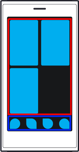
First we divide the home screen into 2 areas: the red area includes the covers of running apps, and the blue area is where the shortcuts occupy. The solution is quite easy: if you have more than 9 covers in the home screen, swiping up and down in the red area will browse the covers; while swiping up from the blue area(exclude the bottom edge of the screen) will bring you to the Launcher. Swiping up from the bottom(edge) of the screen will be different from swiping from the blue area – which brings you to the Events View.
Finally I will talk about my ideal Sailfish gestures on home screen, which is really similar to the 1.x style.
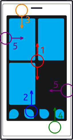
Again, the sample image is from the Jolla User Guide based on Sailfish 1.0. It’s OK to have a 2.x style panel on the top of the home screen.
Gesture 1 (Swipe up and down in the apps cover area): Browse the covers when more than 9 apps are open.
Gesture 2 (Swipe up from the shortcuts area): Go to the Launcher.
Gesture 3 (Swipe down from the top of the screen): Lock screen.
Gesture 4 (Swipe up from the bottom of the screen): Go to the Events View.
Gesture 5 (Swipe from the left or the right edge fo the screen): Go to quick ambience setting.
Sadly, I know that it might be too late to talk about the Sailfish UI now, as Sailfish 2.x has released for more than 2 years. And I don't mean I want to change all the things back to 1.x style. What I'm talking about is just the home screen layout and gestures and the way to enter the Events View. I know if the UI changed a lot again, some of the apps, especially some patches for Sailfish 2.x that lots of great developers made will no longer work. So, if the UI can’t change a lot again, at least I hope that the “swipe up from buttom to enter Events View” will come back. Even putting the Launcher beside the home screen instead of putting Events View there is more acceptable for me (if most people choose the “Events View” in my poll).
