We have moved to a new Sailfish OS Forum. Please start new discussions there.
80

High Contrast Ambiences --> summer ready

asked 2014-06-07 15:43:43 +0300

Morpog gravatar image

updated 2014-07-31 10:21:01 +0300

jiit gravatar image

Hello together,

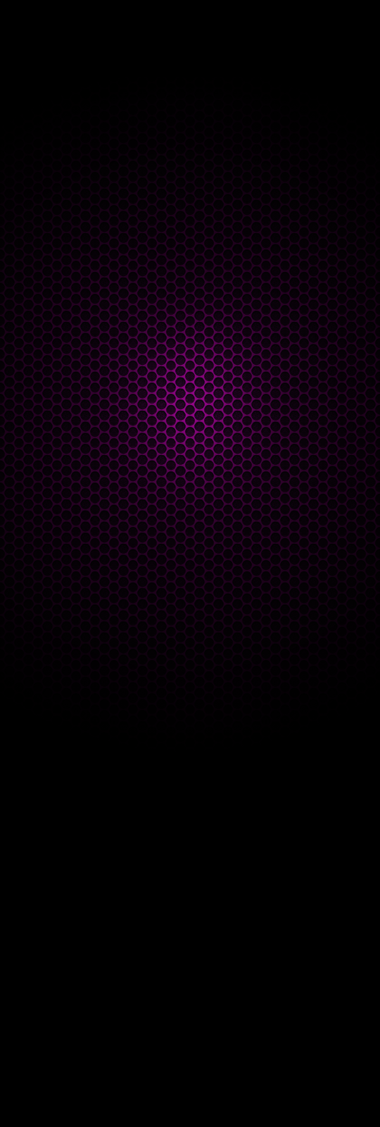
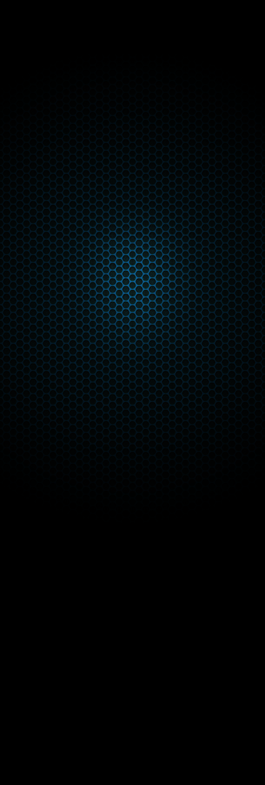
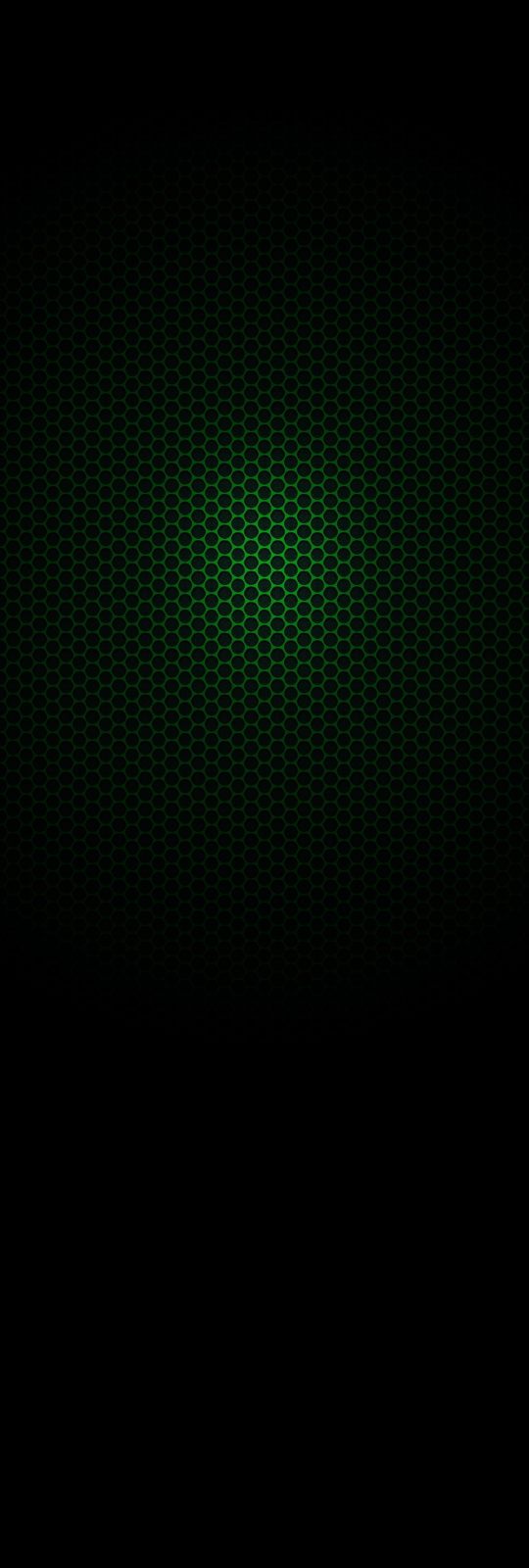
the ambiences are kinda hard to read in summer, so I made 2 minimalistic ones to improve readability outside in summer times. Maybe we can collect more in here? File dimensions should be 1600 height and 540 width.

Meego-Harmattan purple style image description

Meego-Harmattan cyan style image description

green style

image description

edit retag flag offensive close delete

Comments

1

Great idea, thanks!

sunkan ( 2014-06-07 16:03:22 +0300 )edit
1

I owe you a beer, thanks.

magullo ( 2014-06-07 16:09:21 +0300 )edit

Thanks for these wallpapers / ambiances, really nice!

seiichiro0185 ( 2014-06-07 16:51:19 +0300 )edit
1

Thanks!

Edit: the green one works out very nice.

nthn ( 2014-06-07 17:36:11 +0300 )edit
2

Human eyes are more sensitive to green color, that's why contrast seems higher. (To convert a picture from color to grayscale we usually use 72% of green 21% of red and 7% of blue). Just to say that green color is the best color for summer ;)

Bnurb ( 2014-06-08 13:32:59 +0300 )edit

12 Answers

Sort by » oldest newest most voted
22

answered 2014-06-10 22:22:36 +0300

molan gravatar image

Thanks to @Morpog's idea I made this set of ambiences. You find them in various colours here: http://www.allboutn9.info/2014/06/tourmaline-high-contrast-ambiances.html

image description

edit flag offensive delete publish link more

Comments

link doesn't work. Is it possible to them with a white highlight color instead of a "color"? I used to do this manually with the gconftool-2 command but that doesn't work anymore in 10.7.6

manut ( 2014-06-11 02:10:09 +0300 )edit

@manut Try open the link again, it should work fine. Else you find a link on the picture above (lower corner right). I tried it with a black&white version - but in seems SailfishOS choses a random color for the ambience (in my case orange). But I can upload the b&w version if you'd like to have it.

molan ( 2014-06-11 09:50:50 +0300 )edit

Thanks. It works now. Weird. As for the B/W one. Yes please. They look great.

manut ( 2014-06-11 12:17:47 +0300 )edit

@manut White is now available in the original Package as well as single download (on blog). Please let me know what ambience colour you get or if it is orange as well...

molan ( 2014-06-11 13:33:23 +0300 )edit
1

rainisto gave me the solution to create white highlight.

dconf write /desktop/jolla/theme/color/highlight "'#ffffff'" dconf write /desktop/jolla/theme/color/secondaryHighlight "'#aaaaaa'"

more info here: https://together.jolla.com/question/45733/gconfdconf-and-symlink-of-nemo-dir-to-android-dir/#comment-46050

manut ( 2014-06-12 11:03:24 +0300 )edit
13

answered 2014-06-16 14:12:37 +0300

Morpog gravatar image

And another one!

image description

edit flag offensive delete publish link more
10

answered 2014-07-27 12:18:24 +0300

Moth gravatar image

Kiel

Kiel

edit flag offensive delete publish link more

Comments

I like this one. It has kind of a vintage feel to it, but I can't quite put my finger on it.

Venty ( 2014-07-30 17:41:00 +0300 )edit
9

answered 2014-06-07 23:56:04 +0300

molan gravatar image

updated 2014-06-08 01:41:55 +0300

Here's a high contrast version of the MeeGon sailor (original here: https://twitter.com/AllBoutN9/status/474227310665932800/photo/1) being observed by someone with a binocular ;-)

Enjoy your summer Sailors :-)

image description

edit flag offensive delete publish link more

Comments

Thank you all. Maybe now it is possible to view or type SMS in sunny day :)

Jolla095 ( 2014-06-08 10:59:34 +0300 )edit
1

Thanks @caprico! I'm switching between the two versions depending on whether I'm indoors or outdoors :D

cybette ( 2014-06-10 00:38:22 +0300 )edit

@cybette: Hihi same here :D

molan ( 2014-06-10 22:23:54 +0300 )edit
9

answered 2014-06-10 22:40:18 +0300

Morpog gravatar image

updated 2014-06-10 23:02:13 +0300

Based on caprico's Sailfish logo idea, I made this grungefish wallpaper. Edit: Reworked it a bit.

image description

And while I was on it, I made another one: Dark Tiles

image description

edit flag offensive delete publish link more
6

answered 2014-06-07 17:37:47 +0300

Moth gravatar image

updated 2014-08-05 19:51:27 +0300

Blutmond

blutmond

edit flag offensive delete publish link more

Comments

wow, as summer approaches even ambience are growing and getting better!

magullo ( 2014-06-07 18:57:19 +0300 )edit
4

answered 2014-08-01 00:33:13 +0300

Moth gravatar image

updated 2014-08-01 02:56:49 +0300

Bait!

Edit: additional filter.

bait

edit flag offensive delete publish link more
4

answered 2014-08-04 19:11:01 +0300

Moth gravatar image

updated 2014-08-05 17:18:22 +0300

Ruler

Edit: Update

ruler

edit flag offensive delete publish link more

Comments

Great! I appreciate your efforts, it seems, that they always lead to beautiful ambiences!

Daniel ( 2015-03-29 00:35:57 +0300 )edit
4

answered 2015-06-15 18:00:08 +0300

molan gravatar image

updated 2015-06-15 18:00:38 +0300

Summer and the bright sun are back (at least for half the planet). Thus I made this dark-side of the moon ambience. Yep, it's really dark and no colours...but that's how it's supposed to be for a high contrast ;-)

Chose your own (bright) ambience colour, by saving the picture as a favourite ambience.

DarkMoon Ambience

edit flag offensive delete publish link more

Comments

1

Thanks, heading to Jolla.

magullo ( 2015-06-15 18:42:26 +0300 )edit
3

answered 2014-07-20 15:55:35 +0300

Moth gravatar image

Hulk of the seas

hulk_of_the_seas

edit flag offensive delete publish link more

Comments

Looks like prometheus engineer

szopin ( 2014-07-27 20:50:13 +0300 )edit

@szopin You're watching too many movies... ;-)

Moth ( 2014-07-27 22:24:27 +0300 )edit
Login/Signup to Answer

Question tools

Follow
16 followers

Stats

Asked: 2014-06-07 15:43:43 +0300

Seen: 5,094 times

Last updated: Jun 15 '15