Ugly rendering of large fonts
asked 2014-12-19 12:10:57 +0300
When an application uses a large font the font rendering dosn't look too nice. All curves come very jagged. Below is an example from two different applications. The same problem can also be witnessed in the lockscreen clock, but the as the font is a bit smaller there, the problem is not so clearly visible.
Is there is something an app developer could set in the code to make the redering more smooth? Or is this a problem in the system libraries?
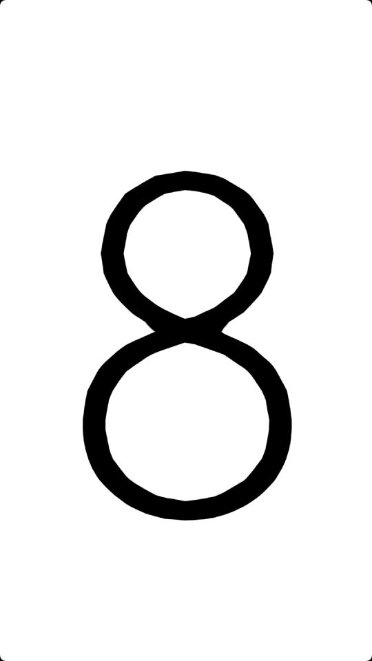
screenshot from Screen-Message app
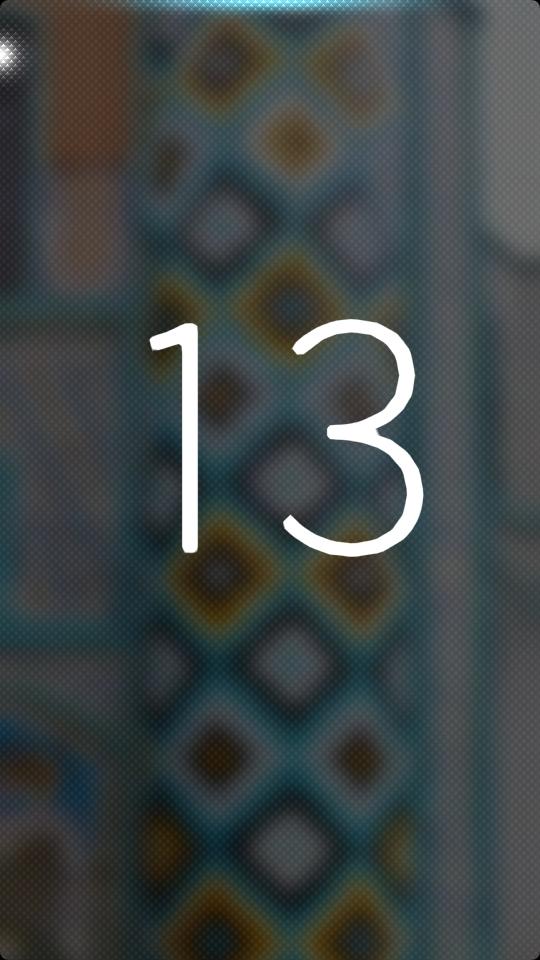
screenshot from Planning poker app
Looks like a font issue, in which case there is nothing the app developer can do :( Have the fonts been dumbed down to save a little space?
pichlo ( 2014-12-21 10:33:24 +0300 )editI just have to comment here. Large digits on lockscreen clock are terrible. Their jagged edges are obvious even from the normal viewing distance (I must admit that I have good eyesight though). If there is something that can be done about it, it would be great. In case of the lockscreen clock, using bitmap glyphs for 10 digits and ":" divider won't consume a lot more memory, and results will be much more pleasant to the eye.
Flickta ( 2015-03-06 14:35:53 +0300 )edit