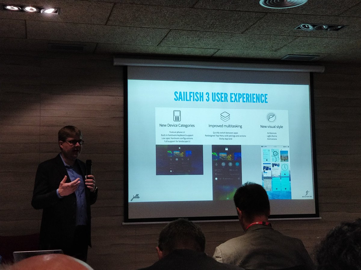
Sailfish 3 User Experience.

In this pic there is a first view of the new sfos UI. What appears to be the swipe down gesture that now only gives you the option to lock or only switch ambience got the features that were hiding in the pull down menu of the notification screen. Good.
A question and suggestion. Q1. Is this a pulley menu on the lock screen or the swipe gesture?? S1. Can we at last have the down swipe to lock the device and have what is shown in the pic in a pulley on the lock screen (or home screen).
Also. Something needs to be done with the way we close multiple apps.
Video Demo: https://www.youtube.com/watch?time_continue=23&v=HnnngoFtrSQ (it was added in the comments by @atlochowski)
demo of SailfishOS 3 https://www.youtube.com/watch?time_continue=23&v=HnnngoFtrSQ
atlochowski ( 2018-02-26 16:48:06 +0200 )editWell the quick close/ lock could come back then because for closing and loking 2 handed use is acceptable. The quickswitch looks good and the buttons in the pully :) question would be how to reach it inside an application, i want quick access to buttons and eventsview (and i still prefer sf1 way with patch)
NuklearFart ( 2018-02-26 18:22:43 +0200 )editwhat a hopeless UI..
paoletto ( 2018-02-26 21:48:59 +0200 )edit