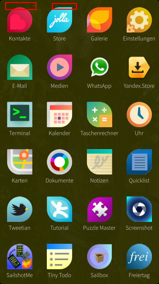
Enhance launcher appearance [released]
Use a thicker fontweight for text, as it's grainy on the qHD screen. Edit: fixed with 1.0.2.5
Also disable antialiasing on the launcher icons, as they get blured on the edges. Edit: fixed with 1.0.3.8
Edit: reopened after further comments (Edit by @ssahla, March 24th: Icon issue fixed in 1.0.4.20, font issue improved in 1.0.2.5 but still not optimal in 1.0.4.20.)
Marked two icons to show the bluring on the edge boundaries:


n.b. the blurring of top edges is this issue https://together.jolla.com/question/11164/screen-rendering-weird-pixel-interpolation/
vitaminj ( 2014-01-10 20:51:31 +0300 )editThis doesn't appear to be fixed for me. Round icons like the clock still have a bump on the top.
Bizarrely, if I move the clock to the first row of 4 icons that appear on the multitasking view, the bump disappears and it's rendered as a perfect circle.
I'm running 1.0.3.8
aegis ( 2014-02-01 16:39:52 +0300 )editI agree with @aegis, this is not (properly) fixed in 1.0.3.8. Top parts of icons still don't look good. Also the font anti-aliasing is still not optimal; most visibly the letter W (both upper and lower case) looks jagged – better than in @Morpog's original screenshot, but I think it could be better.
ssahla ( 2014-03-01 00:01:12 +0300 )editAccording to AllBoutN9, the icon-top-deformation is fixed in 1.0.4.1.
ssahla ( 2014-03-02 20:39:23 +0300 )editI noticed that you can influence the text antialiasing system-wide by editing the variable
ssahla ( 2014-03-09 21:25:45 +0300 )editQT_DF_RANGEin/var/lib/environment/nemo/50-jolla-ui.conf. A bigger value means stronger antialiasing = less visible pixels. The default value (in 1.0.3.8) is 0.08. I changed it to 0.15, and I think text (at least in the launcher screen) looks better now. Stronger antialiasing also means that edges get a bit softer, so the optimal value is a compromise between sharp edges and smooth curves; I haven't tested what would give the best results, but I think maybe Jolla should consider increasing the default value – ping @dez.