We have moved to a new Sailfish OS Forum. Please start new discussions there.
82

"del" and "cursor arrows" on keyboard are needed & essential

asked 2013-12-27 23:02:51 +0200

t0mps0 gravatar image

updated 2015-01-28 16:22:08 +0200

jiit gravatar image

When mobile, text fields are impossible to edit from the middle etc. because you cant see the whole text and point it. Also pointing is rather hard with small text and big fingers.

Would it be possible to add "del" and "cursor arrows" to keyboard? It would make text editing a breeze.

edit retag flag offensive close delete

Comments

I've now uploaded an Estonian keyboard (not too far from Finnish :) ) with 4 arrows, check it. Where would you like to put the DEL?

CsTom ( 2014-01-01 18:54:45 +0200 )edit
1

Actually, I find that except for terminal use, the current input method is OK. I am not sure you noticed, but if you tap and hold the text entry, the text field is magnified, and you can move the cursor around easily enough. That may not be enough for you, but it works for me.

mikelima ( 2014-01-03 20:46:47 +0200 )edit
6

The missing arrow keys are most problematic in the messaging-app, where I have accidentialy sent a text message whilst trying to edit text close to the right screen border several times, tapping the 'send' button instead of the text.

ih ( 2014-01-15 15:00:27 +0200 )edit
3

Added feature-request tag so this thread can be found easier. I would love to see the directional arrows as well.

typo ( 2014-01-16 16:11:26 +0200 )edit
1

Yes, cursors l, r, u, d definitely needed ! ... can't hit first positions before field-entries (e.g. modifying an email account title). Cursor will constantly jump after the first letter of entry & I have to use the backspace which deletes the first letter of the entry.

launchpad ( 2014-01-23 13:57:22 +0200 )edit

3 Answers

Sort by » oldest newest most voted
9

answered 2013-12-27 23:06:41 +0200

pnuu gravatar image

I believe this can be adapted to have also del key. More info can be found here.

edit flag offensive delete publish link more

Comments

3

...although I think "cursor arrows" and "del" and "backspace" would be a bit redundant given the limited space available for the keys... :)

CsTom ( 2014-01-01 17:41:06 +0200 )edit
1

you could cover "delete" behind "shift"+"backspace". I think it was the same with the HW-keyboard on the N900

Cmdr_Zod ( 2014-01-02 11:12:24 +0200 )edit
5

We need it to be done properly by Jolla. Current versions available on maemo forums are not the proper ones - do not work properly in landscape also, the arrows do not work in Android apps. Jolla input is needed here...

Silwer ( 2014-01-03 00:44:49 +0200 )edit
1

Have you taken a look at the keyboard that is currently in use in the official Terminal app on the phone? It got arrow keys and a del button accessed through a shift click. It also has a landscape mode. Maybe you could export it to work as your standard keyboard.

Edir ( 2014-01-03 12:42:38 +0200 )edit

Highly supporting the gequest. At least, the RIGHT/LEFT arrows, as it was, e.g., in Nokia X7. While typing a text, it is next to impossible to place the cursor at the desired point to make a change or correction. Neither there is a way to move it, once misplaced, by a few chars or lines. The arrows would relieve this a**pain.

iourine ( 2017-08-17 22:20:17 +0200 )edit
4

answered 2015-02-13 11:25:31 +0200

r0kk3rz gravatar image

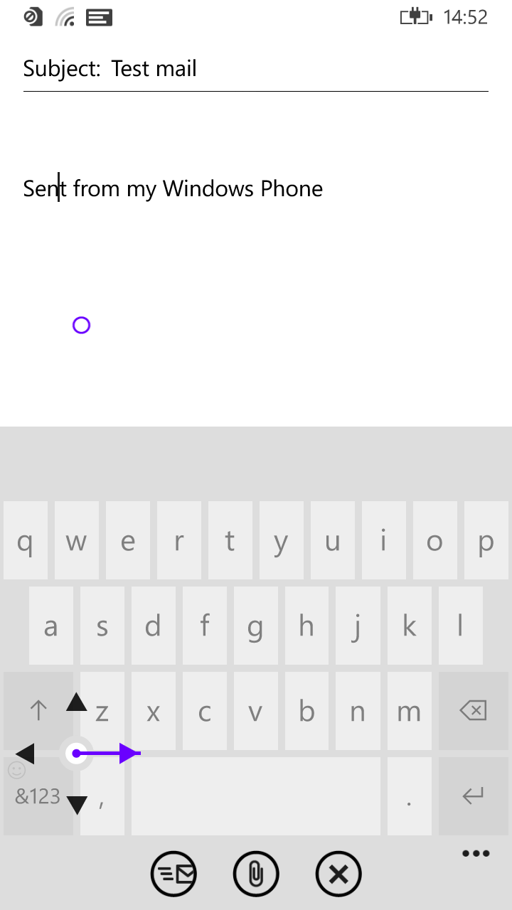
Normally I wouldnt suggest copying features from other operating systems, especially not from Microsoft, but this time they've come up with a reasonable solution to the directional keys on a VKB issue

How this works in practice? not sure, but it might be cool to try something like that out in maliit

VKB-Directional-Keys

edit flag offensive delete publish link more
2

answered 2014-01-28 23:38:41 +0200

Mohjive gravatar image

I think arrows are not needed if a better cursor placement function is available. If you long-press you should get same zoom as when dragging a selection, instead of selecting text as is done now. When zoomed like so you just place the cursor where you want it. Selecting text could be done with a double tap instead.

edit flag offensive delete publish link more

Comments

2

I find this method particularly tricky in small text-fields in a browser, where it would be easier to use arrow-buttons instead. But then again if the swipe positioning is implemented well for this case, arrows might indeed not be needed.

Another options would be to have a somewhat hidden navigation keyboard such as the N9 had, that way it is available when really needed.

avdwoude ( 2014-01-29 00:22:06 +0200 )edit

browser input is a different story, because it's not a native input yet.

coderus ( 2014-06-06 10:05:37 +0200 )edit

I agree. I miss my old N9, text typing was almost perfect there. You could long tap on text (at any point of the text field which was comfortable for you to tap), and a magnifying glass appeared which allowed to easily position the cursor with subpixel accuracy. With N9, I never got into a situation where I would be wishing to have arrow keys.

ScumCoder ( 2015-02-28 01:45:45 +0200 )edit
Login/Signup to Answer

Question tools

Follow
11 followers

Stats

Asked: 2013-12-27 23:02:51 +0200

Seen: 874 times

Last updated: Feb 13 '15