We have moved to a new Sailfish OS Forum. Please start new discussions there.
13

Who can think of a quicker switching window gesture?

asked 2015-01-29 21:30:20 +0200

this post is marked as community wiki

This post is a wiki. Anyone with karma >75 is welcome to improve it.

updated 2016-10-26 12:50:46 +0200

jiit gravatar image

Edited: Handy orientation-defined default gestures, especially in tabbed applications, may be swipe from right to switch tab, swipe from left edge to switch to next open app.

These are like ctrl+tab and alt+tab respectively, in some desktop OS environments could speed work flows for users in flow insomuch as such a mental state is likely wrt handheld computer use. Fidget or flow, it's nice when our tool is so easy to use we hardly notice our smooth pace of work until afterwards because tasks complete early.

edit retag flag offensive close delete

Comments

2

you could always swipe the volume key(s)

szopin ( 2015-01-29 21:55:46 +0200 )edit
1

@szopin: do you mean as in pressing both sides of the volume rocker key ? (currently redundant pending being made useful.)

rdmo ( 2015-01-29 22:26:11 +0200 )edit
1

@rdmo no, swipe (just pull your thumb pressing lightly so both click) from top to bottom for next window/tty/..., from bottom up for previous, if done in quick succession could be recognizable from people pressing bottom for quite long because their headset was unplugged, or adjusting volume by one/two clicks in one direction

szopin ( 2015-01-29 23:07:30 +0200 )edit

10 Answers

Sort by » oldest newest most voted
15

answered 2015-01-29 23:50:53 +0200

tokaru gravatar image

In response to another question some time ago, I have suggested to make use of the release event when peeking. In short words:

  1. peek as usual
  2. release finger on the cover of the app you want to switch to
  3. view should switch immediately, bypassing home screen and the current animations

See here for the original answer.

edit flag offensive delete publish link more

Comments

6

Great idea, but I'm not sure how often I will accidentally switch to an other program and not going back to the home screen as there is not much empty space.

hongakonga ( 2015-01-30 22:59:31 +0200 )edit

I like this one too!

damourti ( 2015-04-25 12:32:47 +0200 )edit
1

@hongakonga it wouldn't necessarily the whole cover area that responds to the release event, it could just be an area in the middle of the cover. Either way, there should be both visual and tactile feedback when entering this area, similar to pulley menu feedback.

tokaru ( 2015-04-27 16:35:13 +0200 )edit
6

answered 2015-01-30 23:29:58 +0200

drcouzelis gravatar image
  • Swipe from the top: Close
  • Swipe from the bottom: Notifications
  • Swipe from the right: Minimize ("Push" application to the home screen)
  • Swipe from the left: Last used application ("Pulled in" from the left)

Benefits: No buttons required, minimal changes to the current user interface, one hand friendly.

Drawbacks: Swiping from the left again and again and again to toggle between two applications can be a little unintuitive.

Note: The left and right swipe from edge actions should be able to be toggled.

edit flag offensive delete publish link more

Comments

You missed lock. Which IMO should be swipe from top. And SFleft should be closed.

ApB ( 2015-01-30 23:46:49 +0200 )edit

which is wat I suggested here: https://together.jolla.com/question/16455/edge-gesture-app-switch/

bilgy_no1 ( 2015-01-31 10:45:59 +0200 )edit
1

@ApB - Locking would work the same way it does now.

@bilgy_no1 - You're right! Upvoted. :)

drcouzelis ( 2015-02-01 03:38:21 +0200 )edit

@drcouzelis

Yes it could but its wrong. One swipe must have one function IMO.

ApB ( 2015-02-01 14:58:06 +0200 )edit
5

answered 2015-01-29 23:33:15 +0200

r0kk3rz gravatar image

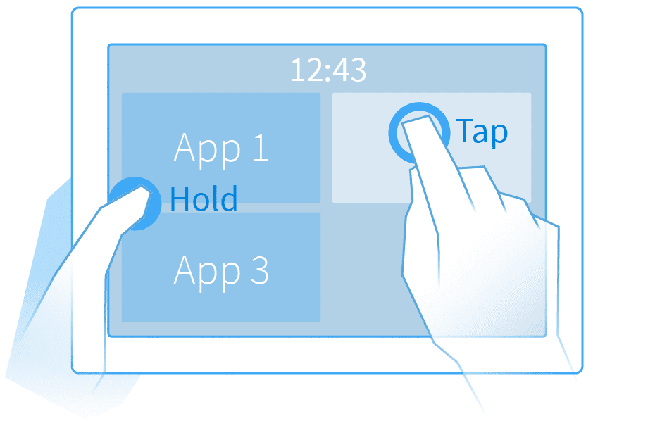
Jaakko has already come up with one, which I hope comes to the Jolla Phone as well.

Its two handed, and takes further advantage of the homescreen peek gesture we all know and love.

image description

edit flag offensive delete publish link more

Comments

1

Multitouch, ok, but what about single-handed use?

chemist ( 2015-01-31 00:01:10 +0200 )edit
1

That would be awful for a phone, and looks distinctly awkward for a tablet.

midnightoil ( 2015-02-01 00:41:33 +0200 )edit
1

You can try it out on your Jolla phone, of course it wont actually do anything but I'm sure you can imagine. I don't think its awful, but the beauty of it is that if it is awkward for you then don't use it, it doesn't break any existing functionality.

I also disagree that we need to provide a one handed gesture for everything, that will quickly get messy as you can obviously do more with two hands than with one in real life. So providing natural two-handed follow on gestures from one handed core gestures is a good way to go.

r0kk3rz ( 2015-02-01 15:30:49 +0200 )edit

Maybe tap and hold for window selection could make use of the remorse timer (visible timeout bar) without implying some kind of regret. The single-handed gesture after long press on an otherwise non-interactive screen area and before the timeout times out, would cause the window thumbnails to be temporarily visible.

This does feel somewhat redundant unless we're talking about browser tab cycling maybe.

rdmo ( 2015-04-25 10:50:42 +0200 )edit
3

answered 2015-01-31 15:32:01 +0200

this post is marked as community wiki

This post is a wiki. Anyone with karma >75 is welcome to improve it.

updated 2015-01-31 15:32:01 +0200

VenomousBane gravatar image

This is not an answer, but just a clarification. Many people have got themselves perplexed about the "swipe from right" and "swipe from left" gestures. The reason for Sailfish having same operation (minimize the app or bring up ambience) is CONSISTENCY. You can hold your phone in either of your hands to perform this action. Here is where one handed use of phone comes into play. So, there is no use in suggesting different actions for swipe left and swipe right. Anyone can correct me if I am wrong here.

edit flag offensive delete publish link more

Comments

1

The CONSISTENCY is broken already. Swipes from left/right work different ways in different screens.

I have no problem with swipe from left and swipe from right doing different actions. After all, left and right have different connotations in my mind anyway. I do not wear my watch on the righ hand. I do not read from right to left.

pichlo ( 2015-02-02 15:35:13 +0200 )edit

I don't think consistency is broken. Swipe from Left/Right from any screen minimizes the app. Does any of the screens break this consistency?

VenomousBane ( 2015-02-04 06:40:16 +0200 )edit

"Swipe from Left/Right from any screen minimizes the app" - except in home screen and you have favourite ambiances defined :)

But my comment was toungue-in-cheek only, it was not meant to be read seriously.

pichlo ( 2015-02-04 15:30:20 +0200 )edit
1

I didn't take it seriously and I didn't mean to be offensive too. Sorry if it was so. I just wanted to make everyone understand about the design of Sailfish OS. Even in home screen, swipe from left or right does the same thing. It doesn't do two different things. This is what I meant by consistency. You can get more info on the design of Sailfish OS from Jaakko's blog.

VenomousBane ( 2015-02-04 19:16:35 +0200 )edit
2

answered 2015-04-25 14:47:03 +0200

Tobbe gravatar image

updated 2015-04-25 14:47:40 +0200

What about this?

  • Swipe from top: Close/lock

    • Swipe from right: Homescreen
  • Swipe from left: Notifications (including toggles for wifi etc)

  • Swipe from bottom: App launcher

  • Two finger swipe from either left or right: Next/previous app

edit flag offensive delete publish link more
1

answered 2015-01-29 22:44:21 +0200

ApB gravatar image

Sadly there isn't one. We only have 4 possible ones and 1 of them has 2 functions. 2 are "wasted" on minimization. Except if we start utilizing 2 finger gestures which goes against the one hand device principal jolla is build upon.

Swipe from outside and tap the next is fast enough IMO.

edit flag offensive delete publish link more

Comments

5

You could also swipe from outside horizontally and then vertically, to go up/down between apps when swiped deep enough, no?

szopin ( 2015-01-29 23:08:25 +0200 )edit
4

As old Opera-user I knew the concept of swipes as "mouse gestures" since years. I think, there are some more possibilities than only swiping from one of the four outer edges to the inside, it's only a question of exercise and habituation. I would find "left-up" and "left-down" feasible, also "right-up" and "right-down".

Robomike ( 2015-01-29 23:26:51 +0200 )edit
1

@rdmo here I was talking about standard swipe from outside, go until the middle of the screen, now you have the homescreen with all icons practically at 100% transparency, holding the thumb down move slightly down and it will start cycling through the next window, move back to the center to stop cycling, swipe up to start cycling backwards, release - you switched to different window. not about the volume keys, this was in the main thread and very unlikely (keys are not expected to be clicked all the time like touchscreen, will wear the hw quickly)

szopin ( 2015-01-29 23:53:04 +0200 )edit
1

Yes to L-shaped swipes.

pichlo ( 2015-01-30 00:47:03 +0200 )edit
1

answered 2015-01-31 21:54:13 +0200

programmer gravatar image

updated 2015-01-31 21:55:17 +0200

I'd suggest "swipe from a corner to desired app" gesture, like in SwipePad app for android (this one: https://play.google.com/store/apps/details?id=mobi.conduction.swipepad.android&hl=en) except:

1) it should show currently running apps (at least optionally) - SwipePad shows user-defined shortcuts instead and

2) it should retain icons (and corners) positions when screen orientation changes, e.g. the first icon should always be in the corner of the screen closest to volume buttons (assuming volume buttons are positioned on the left edge of the phone, closer to its upper edge, similar to how iPhones have it) and swipe from the corner of the screen that is closest to the volume buttons should bring same "swipe pad" both when this corner is top left corner (portrait orientation of the screen) and when this same physical corner is bottom left corner (landscape orientation of the screen) - that is, unchanged (physical) positions on the screen regardless of screen orientation. Of course it will require some clear sign designating phone's "up" and "down" sides, but jolla phone already has it (large "unused" space under the screen) and I'd suggest having something similar in jolla tablet

the 2) is especially important when "screen auto-rotate" option is on - lack of 2) ruined the whole SwipePad experience for me despite the fact that I instantly fell in love with the idea and even considered using SwipePad instead of home screen / launcher

edit flag offensive delete publish link more
0

answered 2015-01-29 23:15:38 +0200

hongakonga gravatar image

updated 2015-01-29 23:17:46 +0200

I'd like something like:

  • Swipe Up from lower edge: Home screen
  • Swipe right from left edge: Switch one app forward
  • Swipe left from right edge: Switch one app backward
  • Swipe down from upper edge: Notification

don't see any need for closing an app via swipe

edit flag offensive delete publish link more

Comments

9

No. Just no. Do not take away the most useful gesture, closing the app with a swipe. If you do, I will give my Jolla to the Gypsies.

pichlo ( 2015-01-30 00:44:08 +0200 )edit
0

answered 2015-01-30 22:56:03 +0200

hongakonga gravatar image

updated 2015-01-30 22:56:41 +0200

@Pichino, I'd like to know why this is should be the most use full gesture. Unused programs are closed anyway when memory is short.

I don't know any other OS on the mobile marked which has such a feature. There must be a reason for that.

edit flag offensive delete publish link more

Comments

1

That's because other mobile OS's don't have true multi tasking. Leaving apps open even if you don't need them and waiting until the memory manager decides to close them is a waste of battery life.

shfit ( 2015-01-31 16:55:06 +0200 )edit
0

answered 2015-01-31 10:48:49 +0200

bilgy_no1 gravatar image

This question is a duplicate of:

https://together.jolla.com/question/16455/edge-gesture-app-switch/

We need to find a way to pool votes.

edit flag offensive delete publish link more

Comments

Not exactly a duplicate. I added browser tab switching, just lately.

rdmo ( 2015-03-30 23:02:27 +0200 )edit
Login/Signup to Answer

Question tools

Follow
2 followers

Stats

Asked: 2015-01-29 21:30:20 +0200

Seen: 1,139 times

Last updated: Apr 25 '15